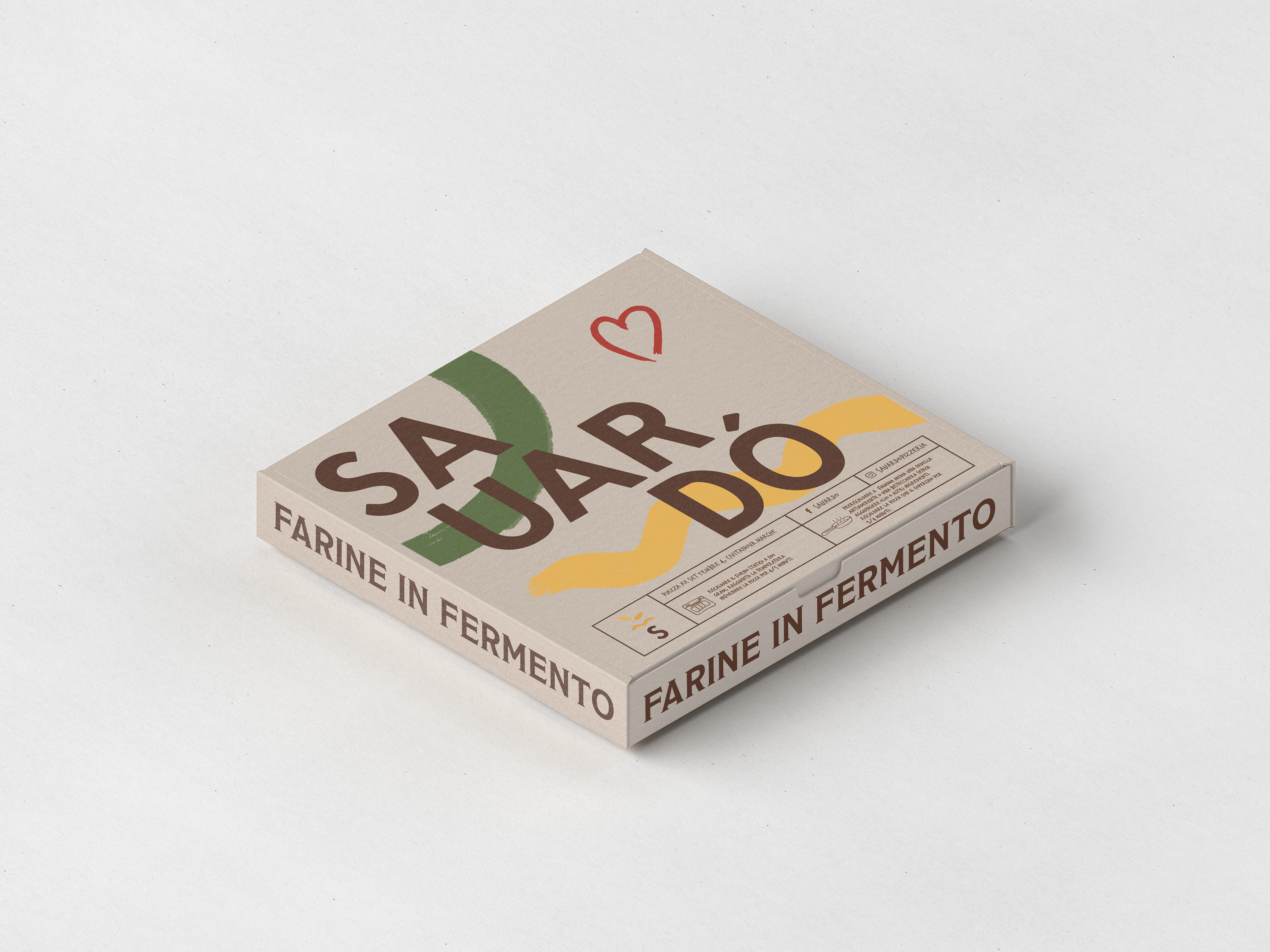
Sauardò
Client: Sauardò
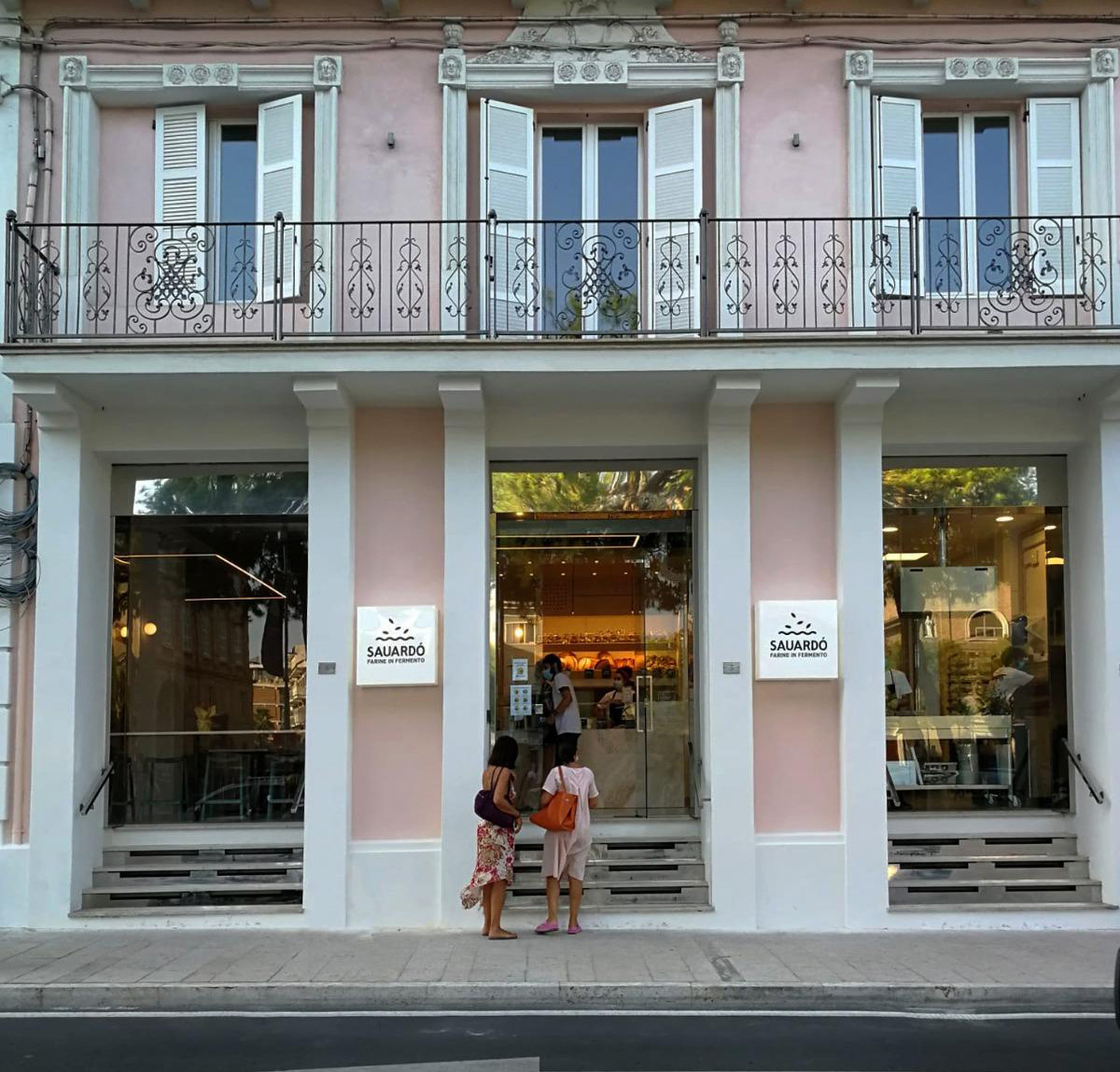
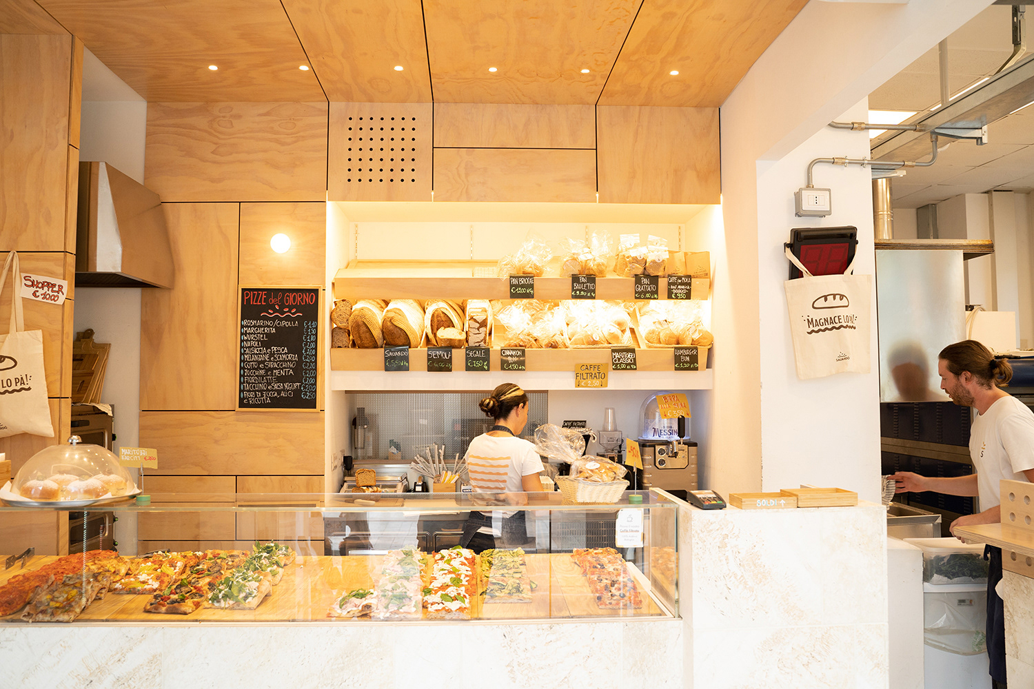
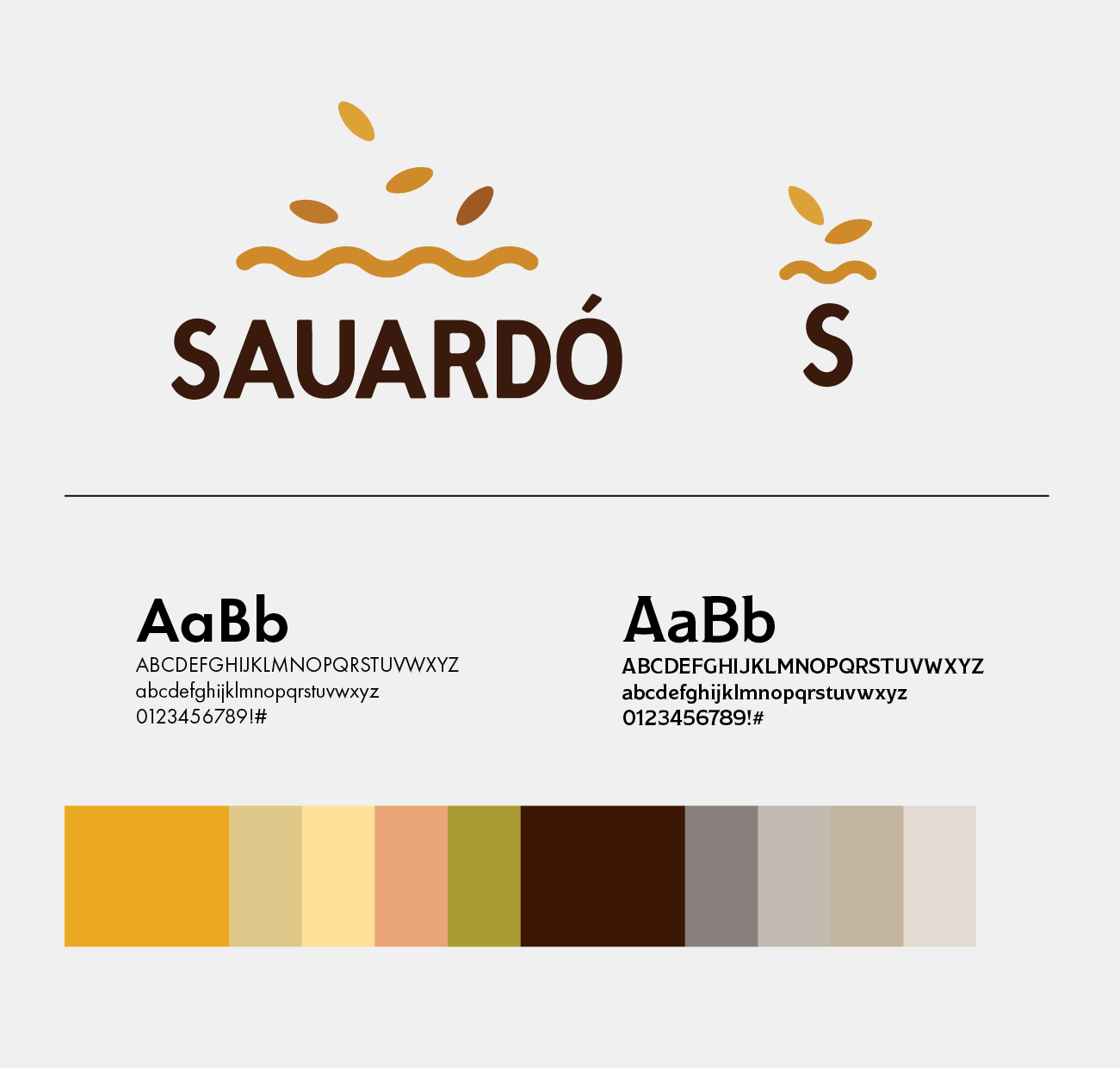
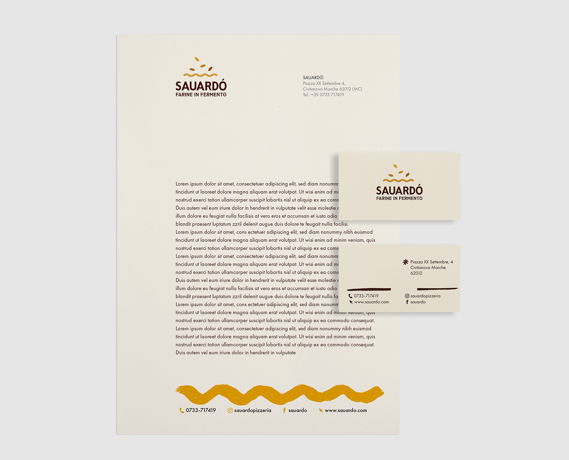
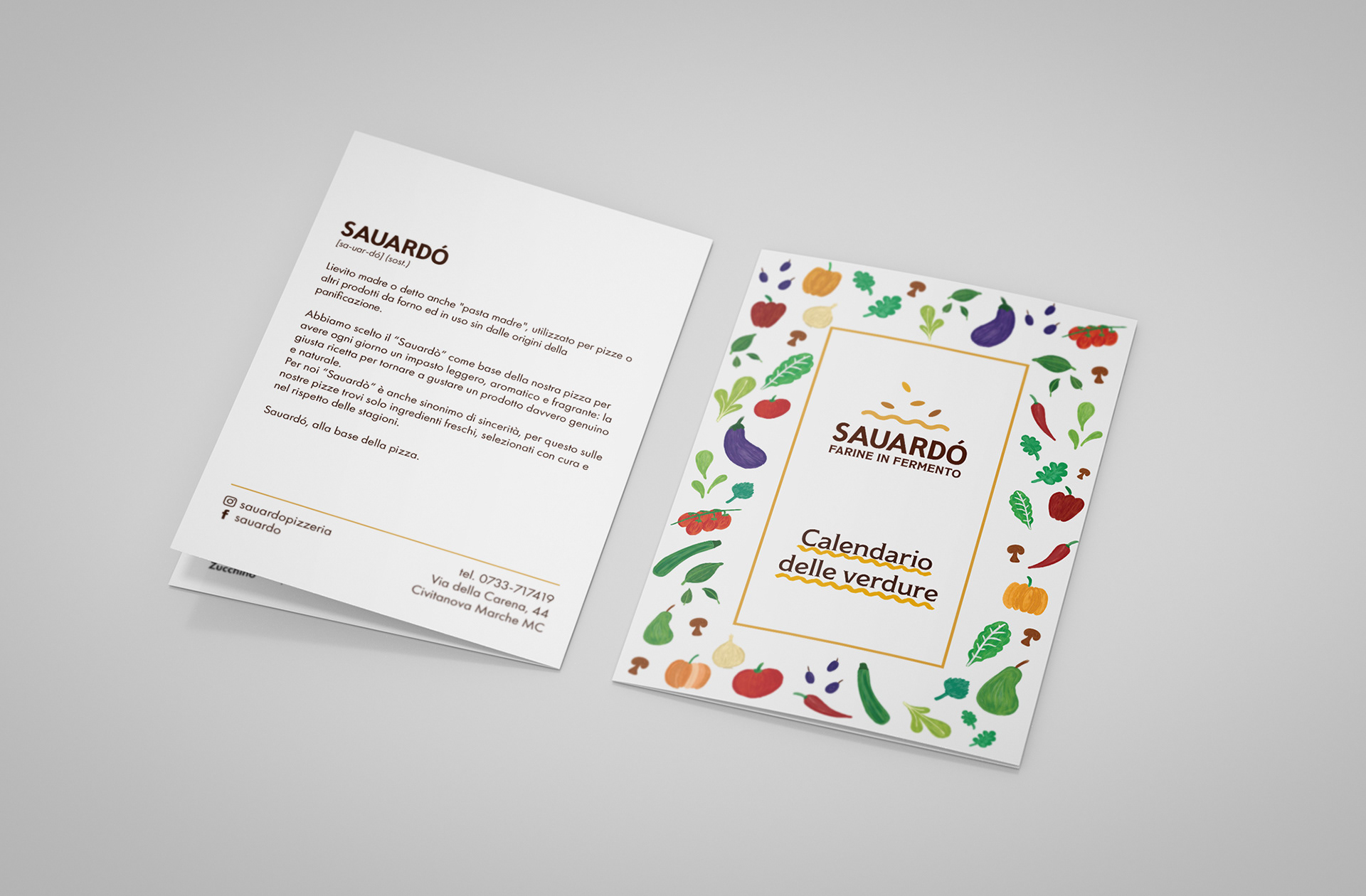
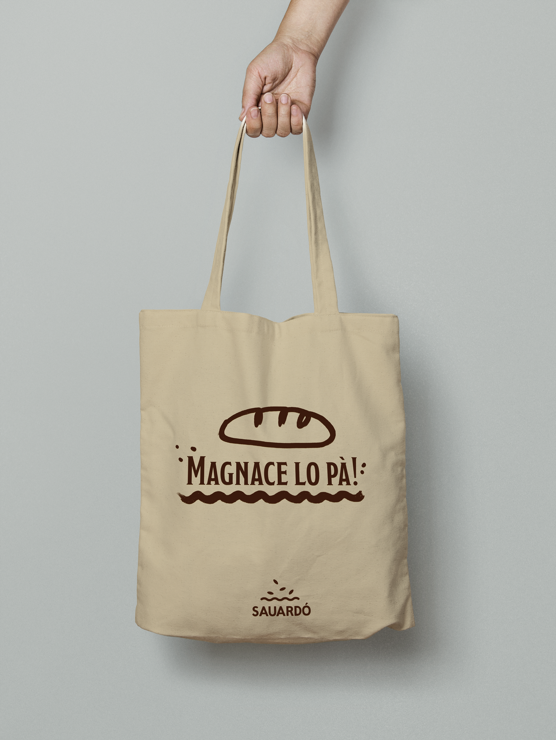
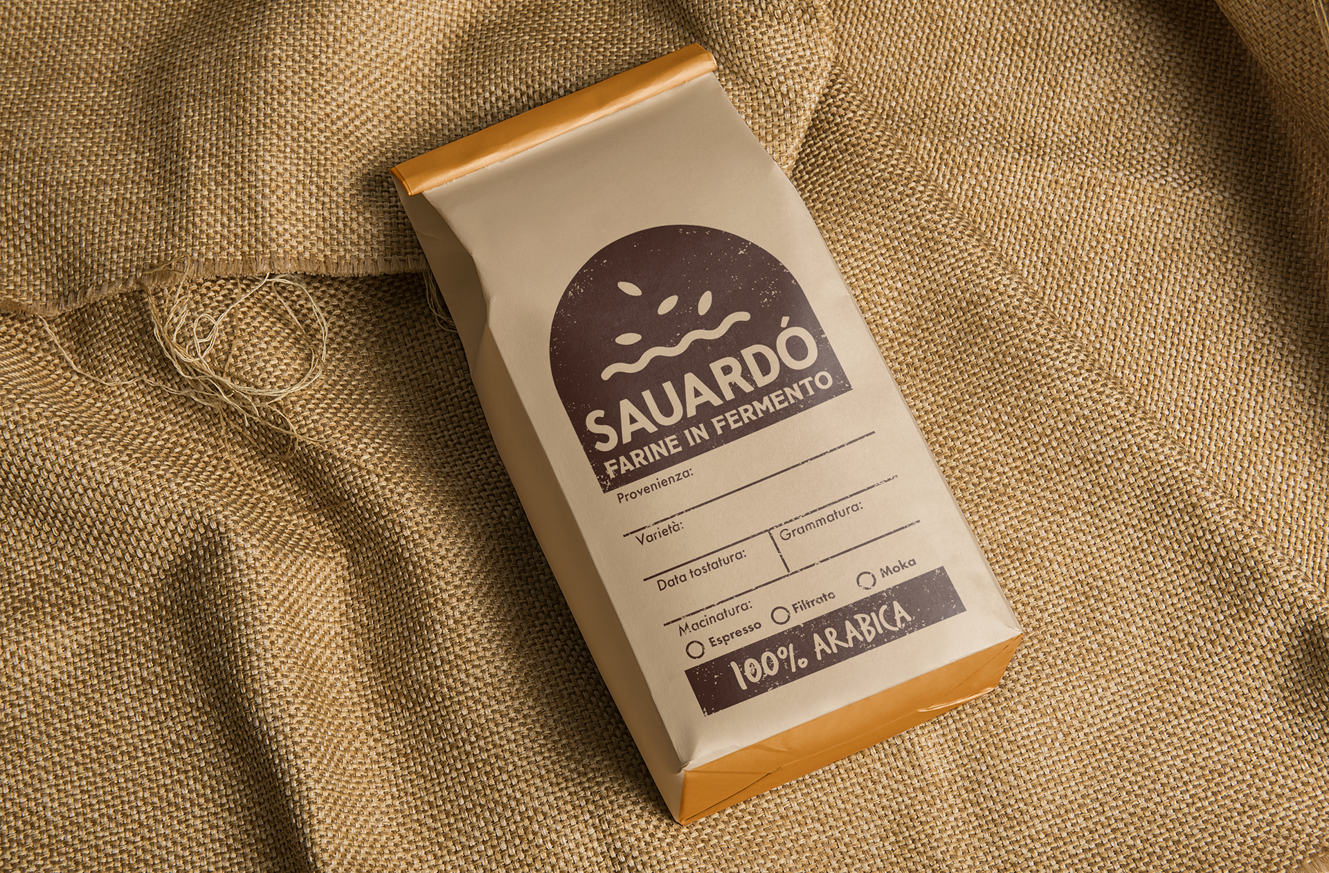
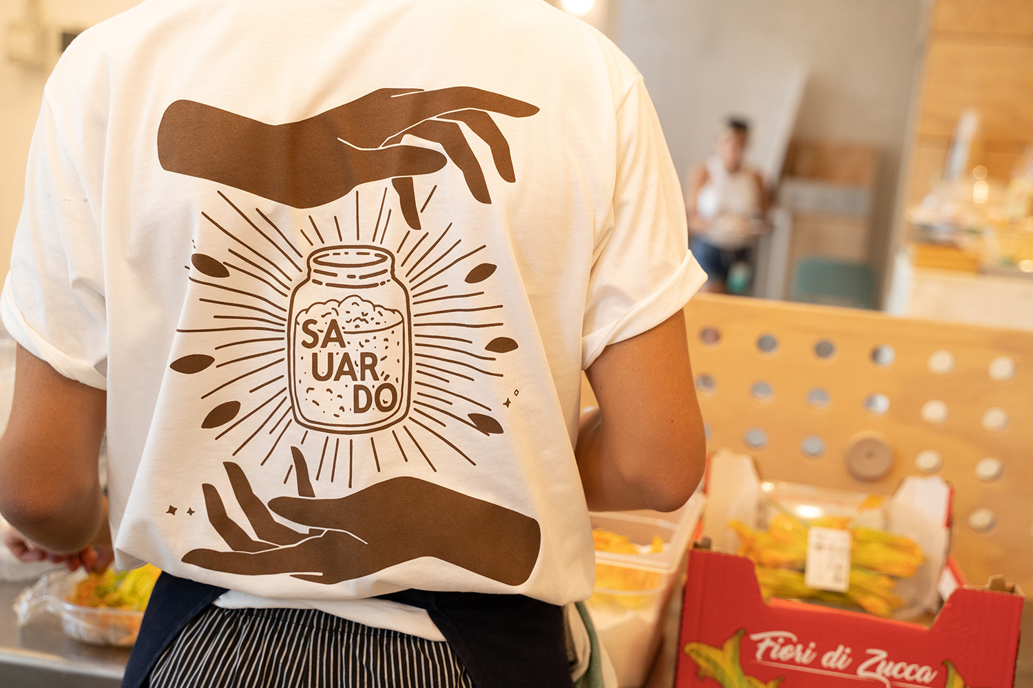
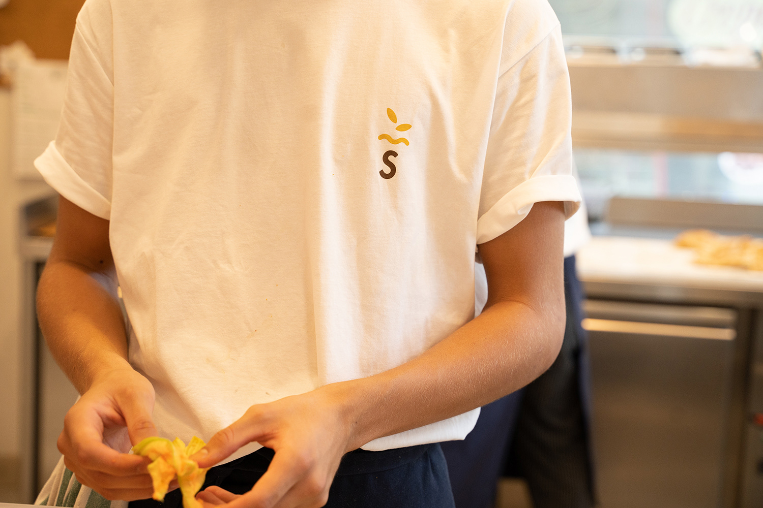
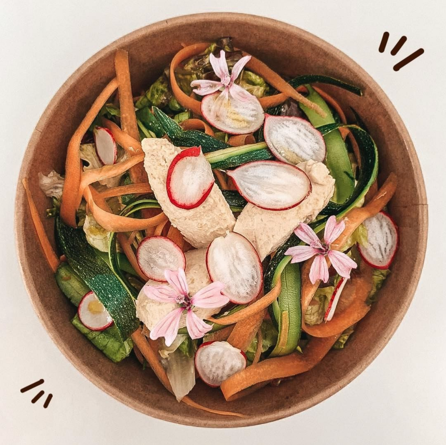
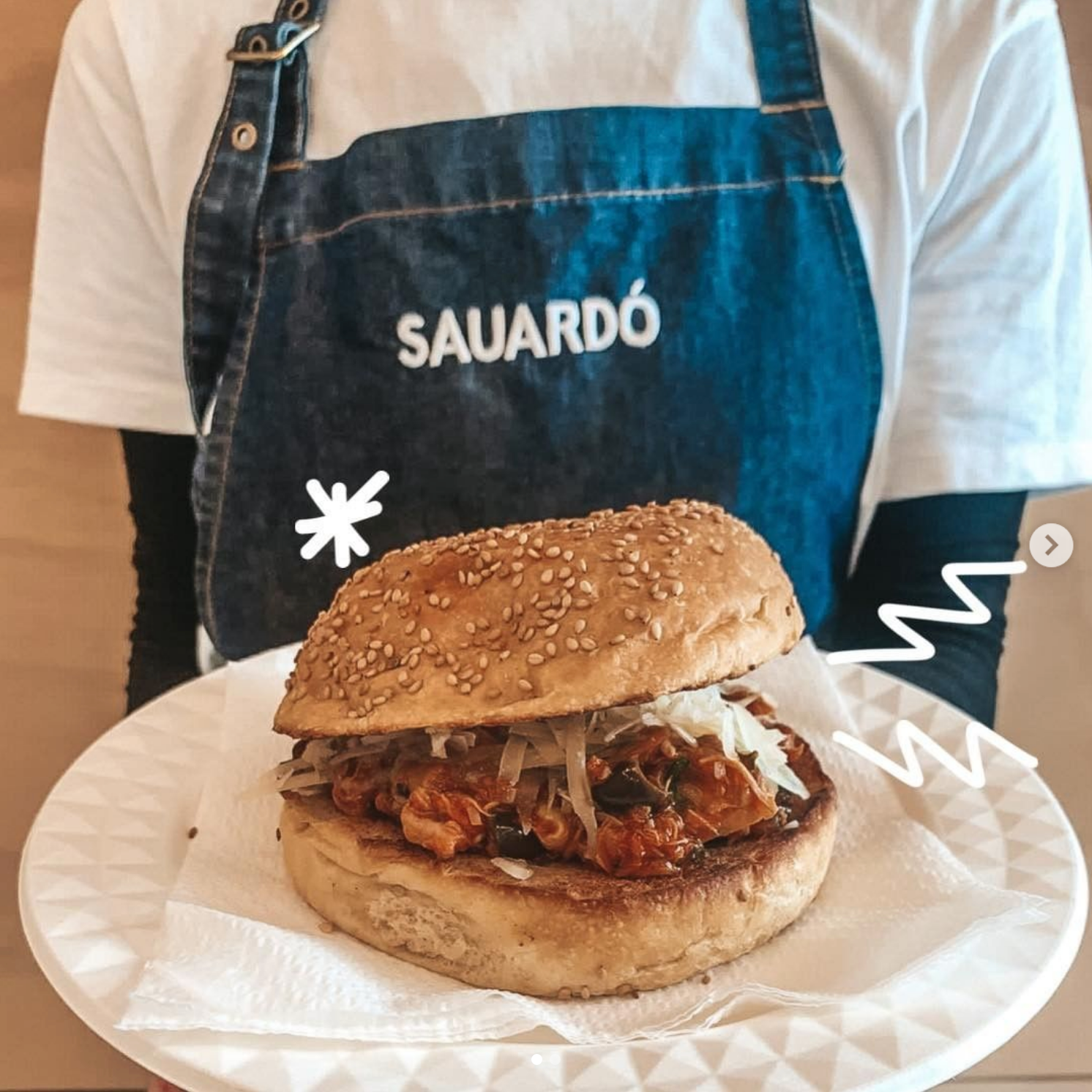
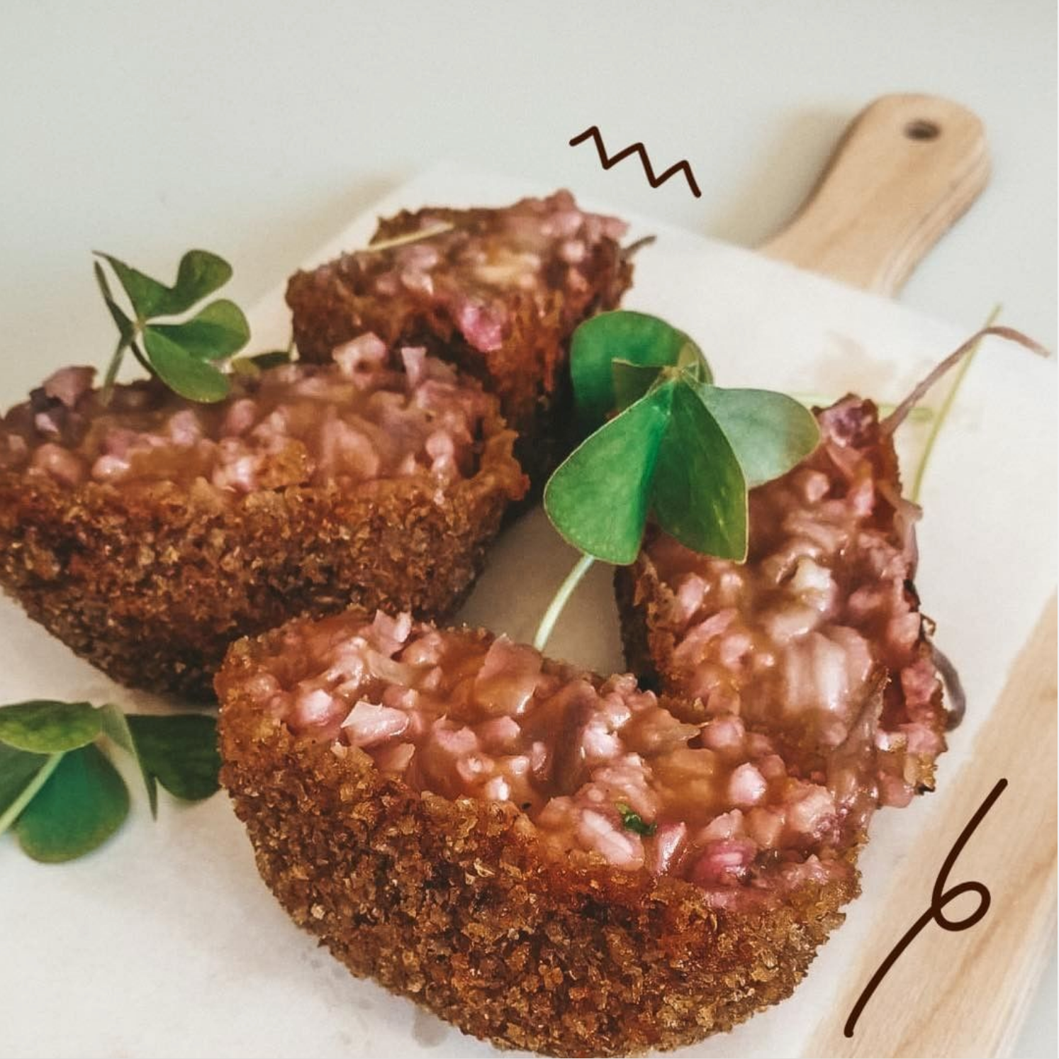
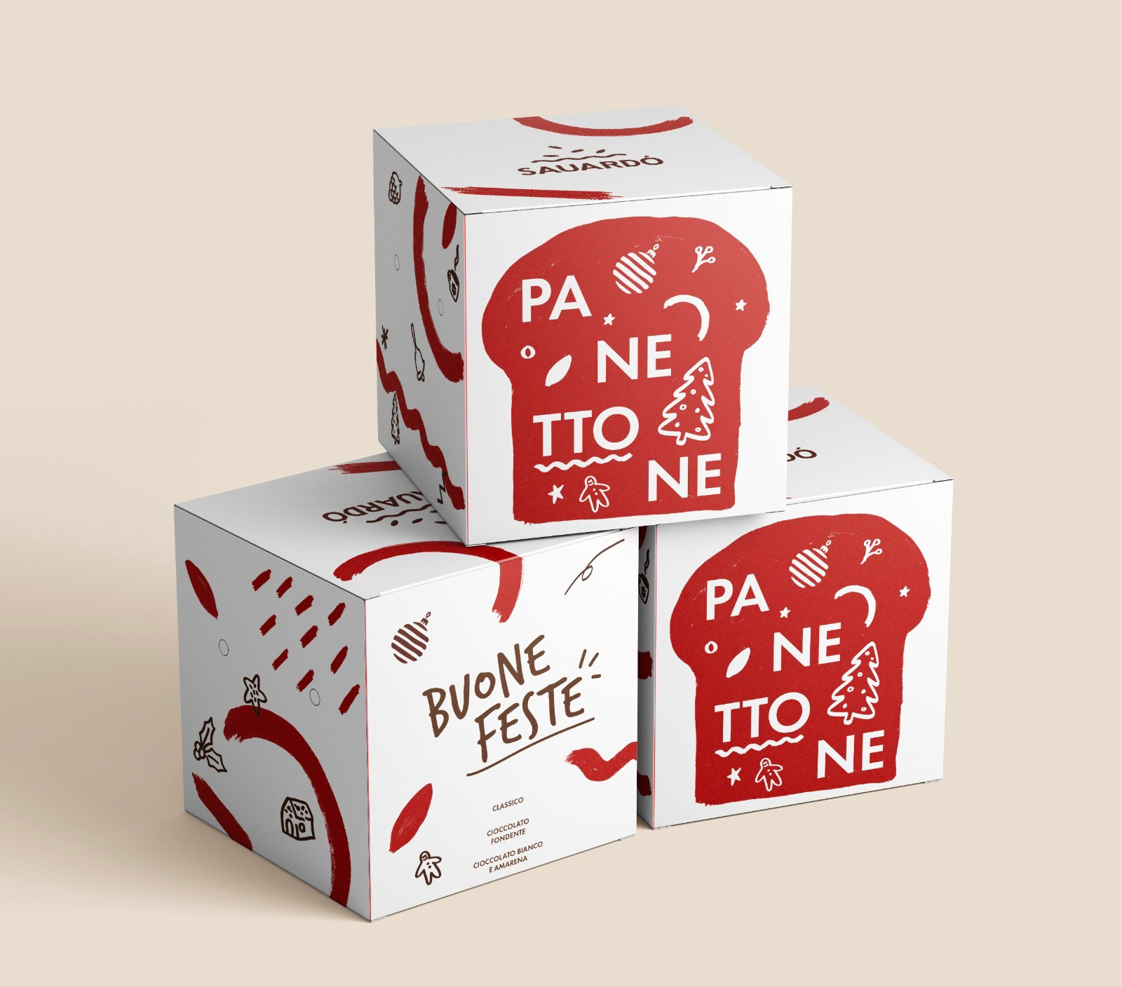
Our branding focuses on highlighting the natural product that we offer, which is also created using a more traditional process by using a sourdough starter and always fresh, local and natural ingredients. The brown and yellow pastel colors bring to mind the grain, cooked dough and the warmth of a grain field. All our communication is simple, friendly and direct. The logo has soft angles, and the core of it is the icon of the pizza base that represents the core of our business. The multiple seeds on top share our eclectic soul in creating original and different topping that gives our pizza its unique taste.